Your landing page is your hardest-working salesperson. Yet most businesses leave conversions on the table with easily fixable mistakes. Here are 15 techniques backed by real A/B test data.
Your headline has 3 seconds to convince visitors to stay. Use this formula:
[Desired Outcome] + [Timeframe] + [Without Common Objection]
Examples:
- ❌ "Welcome to Our Software Platform"
- ✅ "Launch Your Online Store in 48 Hours — No Coding Required"
Impact: Headlines following this formula increased conversions by 32% in our tests.
Expand on your headline with specifics, social proof, or a supporting benefit.
One page = one goal. If you want signups, every element should drive toward that signup button.
CTA button best practices:
- Use action verbs: "Start Free Trial" > "Submit"
- Add urgency: "Get Started Today" > "Learn More"
- Make it visually dominant — contrasting color, large size
- Place it above the fold AND repeat after each section
- Specific numbers: "Trusted by 12,847 businesses" > "Trusted by thousands"
- Recognizable logos: Display client logos prominently
- Video testimonials: 2x more effective than text testimonials
Survey your audience or analyze support tickets to find the top reasons people don't convert. Then address each one directly on the page.
Don't just list features—explain the benefit:
- ❌ "Real-time analytics dashboard"
- ✅ "See exactly which campaigns drive revenue with real-time analytics"
Remove the fear of commitment:
- Money-back guarantees
- Free trials without credit card
- "Cancel anytime" messaging
8. Optimize Page Speed
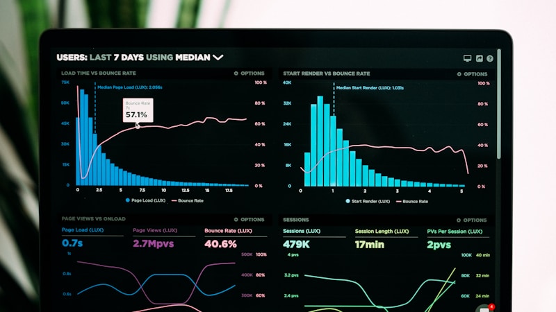
Every second of load time reduces conversions by 7%. Aim for:
- LCP under 1.5 seconds
- Total page size under 1MB
- Use lazy loading for below-fold images
Guide the eye toward your CTA:
- Arrows and lines pointing to forms
- Images of people looking toward the CTA
- White space that creates a visual path
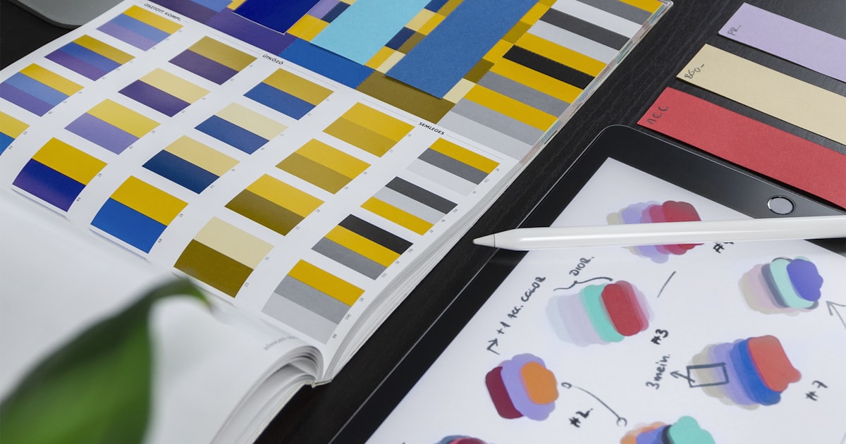
- Blue = Trust and reliability (SaaS, finance)
- Green = Growth and health (wellness, eco)
- Orange = Energy and urgency (e-commerce, food)
- Purple = Premium and creativity (luxury, design)
Every additional form field reduces conversions by 11%. Ask for only what you need:
- Minimum: Name + Email
- Acceptable: Name + Email + Phone
- Conversion killer: 5+ fields
Capture leaving visitors with a compelling offer:
- Discount code
- Free resource download
- Limited-time trial extension
Show different content based on:
- Traffic source (Google vs. Facebook vs. direct)
- Location (city-specific offers)
- Device type (mobile vs. desktop layouts)
Priority testing order:
- Headlines (biggest impact)
- CTA text and color
- Hero image/video
- Social proof placement
- Form design
Instead of asking for the sale immediately, use progressive engagement:
- Step 1: Free quiz or calculator
- Step 2: Show personalized results
- Step 3: Present the offer as a natural next step
Track these metrics:
- Conversion rate (primary)
- Bounce rate (below 40% is good)
- Time on page (2+ minutes is ideal)
- Scroll depth (70%+ reaching CTA)
- Form abandonment rate (below 20%)
Landing page optimization is a continuous process, not a one-time task. Implement these 15 techniques, measure the results, and keep iterating. Even small improvements compound over time.
Want a high-converting landing page? [Contact Heloix](/contact) — we build landing pages that convert at 2-5x industry averages.